
In digging through my archive of bicycling memorabilia (in a former career I actually was an archivist) I found this great cover. It's easy to see why I would keep this issue of Mountain Bike Magazine. This issue was during the heyday of mountain biking in the 1990s when road bikes seemed passe and a war of worlds was happening between what was then considered the two main disciplines of the cycling industry. Basically, Pre-Lance Armstrong taking over the world and reigniting so much interest in road cycling. Who knew that there would now be niche within subniche of styles of riding to navigate. How else do you explain the handwringing so many cyclists do over whether to buy the SOMA Wolverine or the Black Mountain Cross or the VO...whatever. I obsess and lust over those bikes as well. That said, there is a point to be taken from this cover besides seeing Bob Roll get muddy during Paris-Roubaix. Road bikes can do an awful lot of amazing things beyond just smooth as glass pavement rides.
0 Comments
"The Girl Who Has A Bicycle Does Not Need Wings" - Wheel Talk
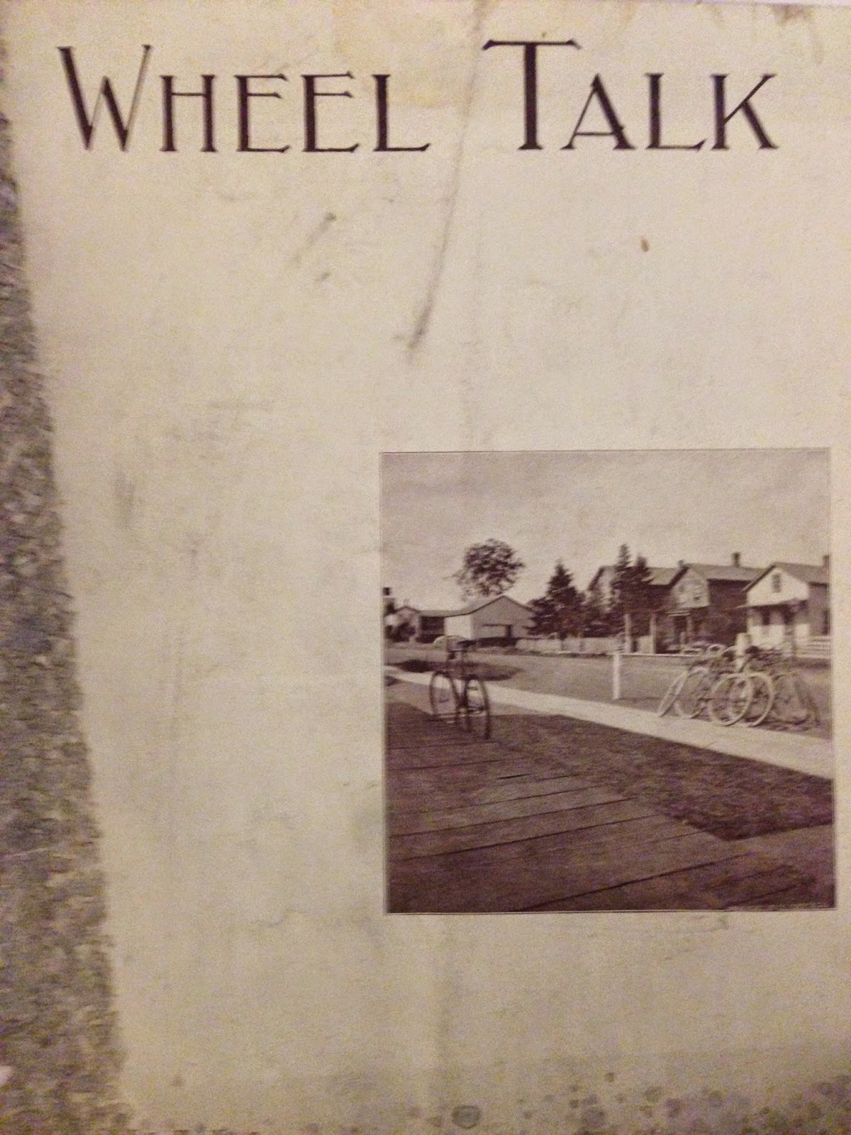
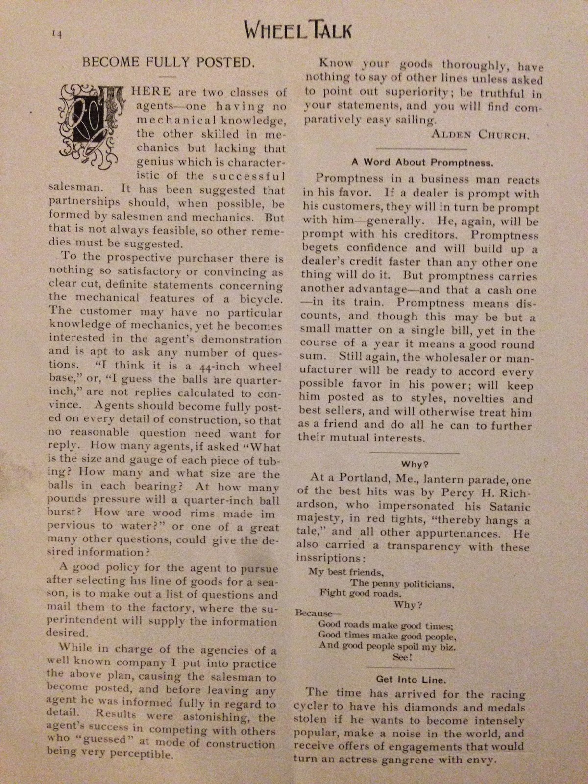
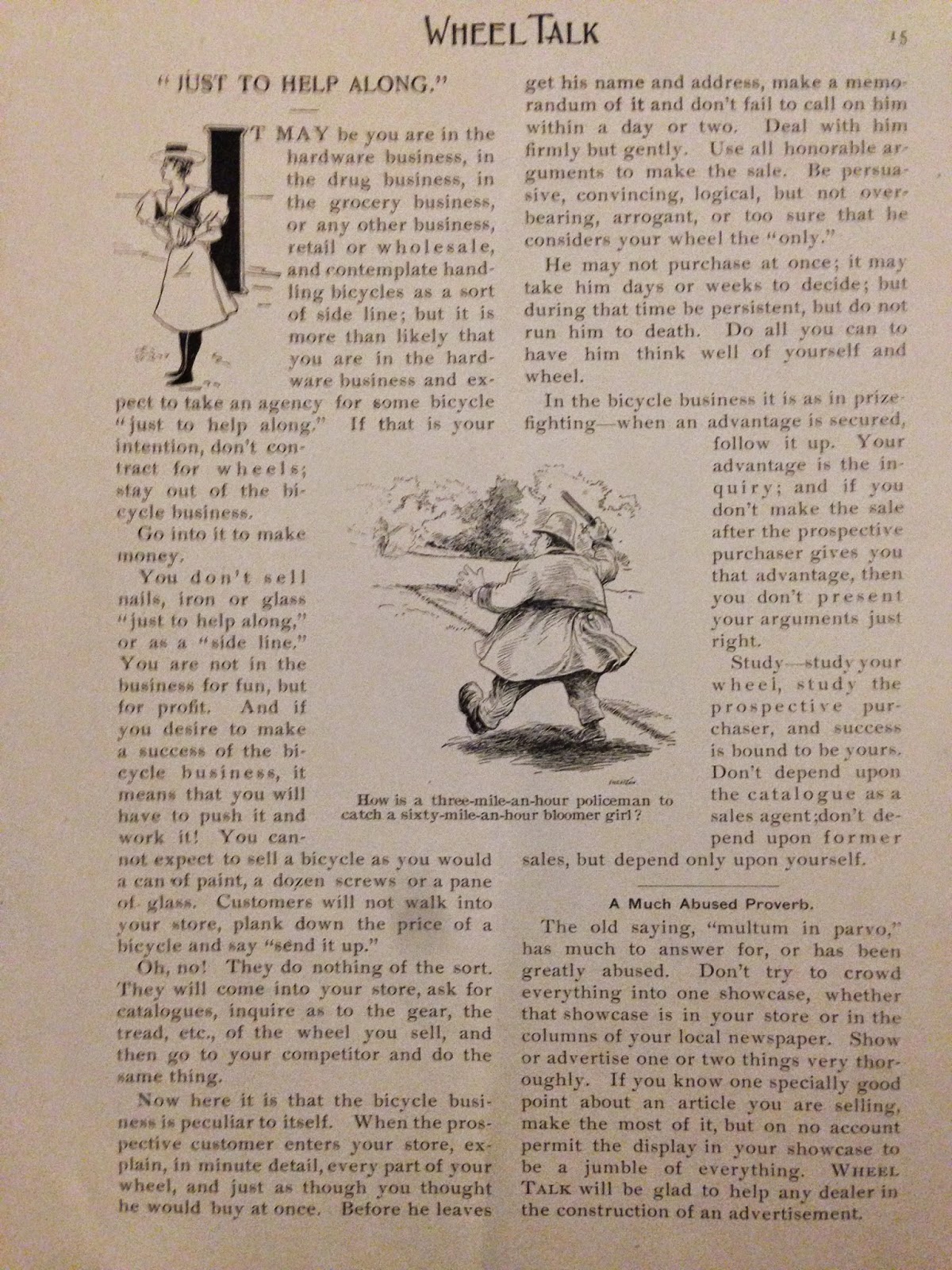
I picked up this antique copy of the publication Wheel Talk recently. Apparently it was published out of the Chicago area during the late 1890s hey day of cycling. Lots of tips and witticisms are included in this brief periodical about enjoying your "wheel" and how to dress, eat, and fully appreciate it. I adore this era of printed material, event more so when it is about cycling. The typefaces, verbiage, and elegant style make these kinds of publications a treat. Sometimes less is more when it comes to graphic design. Actually less is usually more when it comes to graphic design. Something that I try to convey to my students when they are designing things in my classes. Here are a few screen shots of the pages of this slight but fun publication. Some of the advice given in the page below is quite amusing. 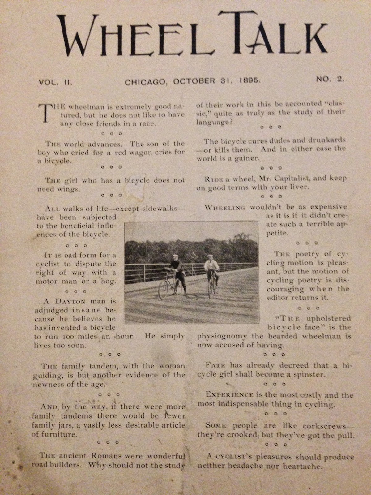


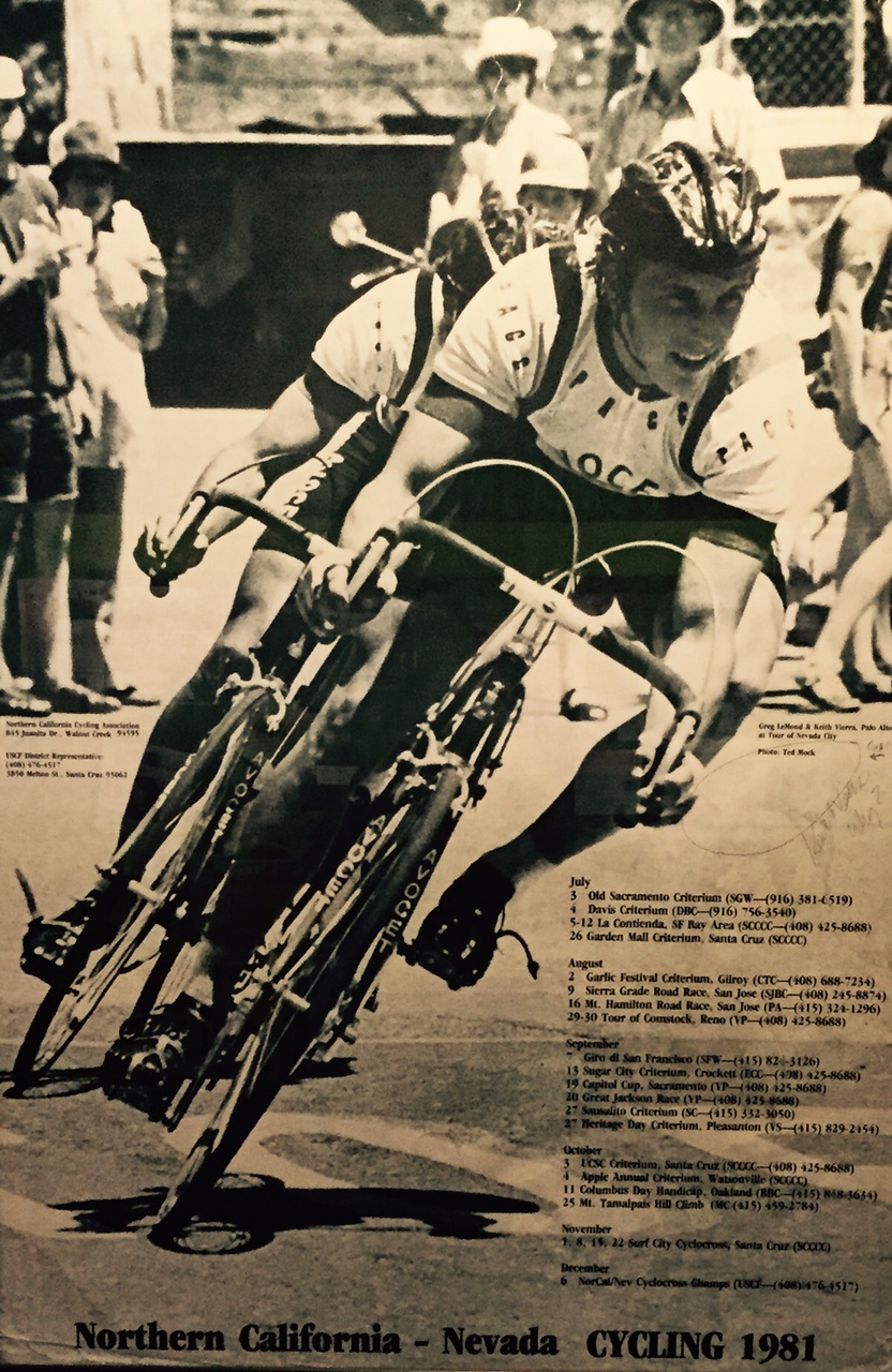
 While waiting for my order at Laughing Planet the other day I snapped a few photos of their Greg LeMond and Roland Della Santa exhibit. I have to say I'm always intrigued by these less obvious color schemes and how classy they can look on a beautiful handmade bicycle frame. I never would have thought an olive green with yellow scheme would look so good but it works! 


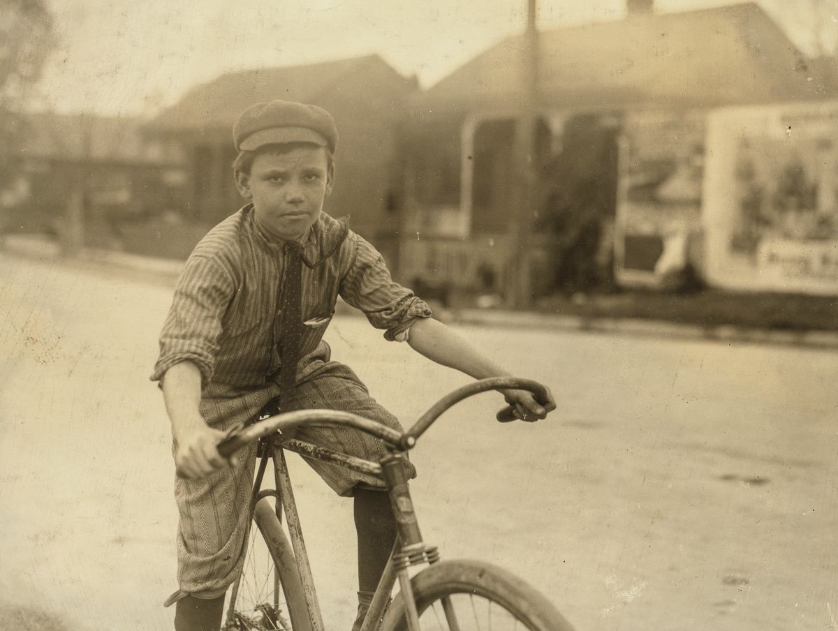
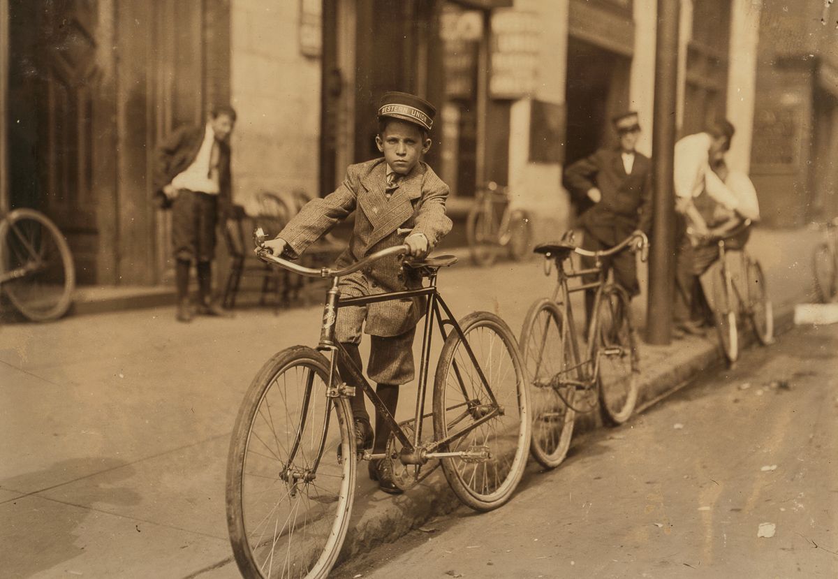
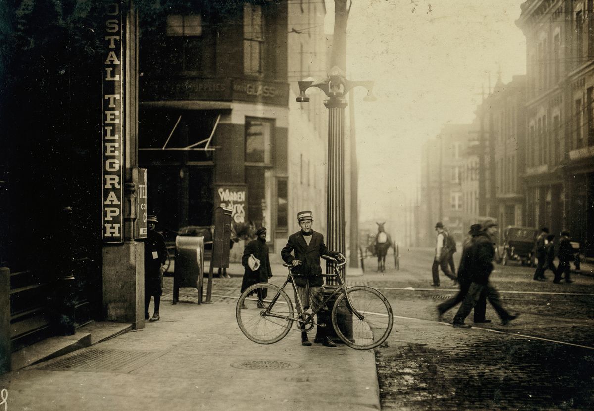
 ...and there's not a beard among them! But I guess none of them look old enough to grow a beard. The best thing about this series of photos is looking at the streetscapes behind them. That, and looking at the details of the machines they're riding. Some of the handlebars are amazing! 


What do you do when a bike you are going to review arrives and includes an out of favor wheel size, a parts spec from the dark ages, and a frame made of that heavy steel material with tubes joined together with a technology so out of date that no major manufacturers have used it in over a decade? You go into the ride carrying some serious baggage about the review. Everything about this bike seems to fly in the face of conventional wisdom.

I opened the box which seemed strangely light and pulled out the frame and rigid(!) fork and noticed how strikingly different the powdercoat paint scheme looked compared to most Agro modern mountain bikes. Subtle even. The clear-coated decals over the “sea foam†green were striking yet subtle. The only mention of the name of the bike was on the downtube and the gleaming brass headbadge, unlike most modern bikes where any bit of open real estate on the frame is an invitation to place yet another logo in case you might forget what kind of bike you’re riding. I had to begrudgingly admit that the overall aesthetic was tasteful and attractive.

The parts spec is going to be crap, though, I thought. There was an awful lot of silver on the components. Weird. Was that actual metal instead of plastic? The top mounted shifters looked so rudimentary. Push lever to extend cable, flick it back to pull cable. So simple. Looking at the parts specs I noticed that they were lighter than the top of the line shifters currently in favor. With so few moving parts I realized the shifter spec was simple, minimal and likely more reliable. Who was this company, “Suntour�
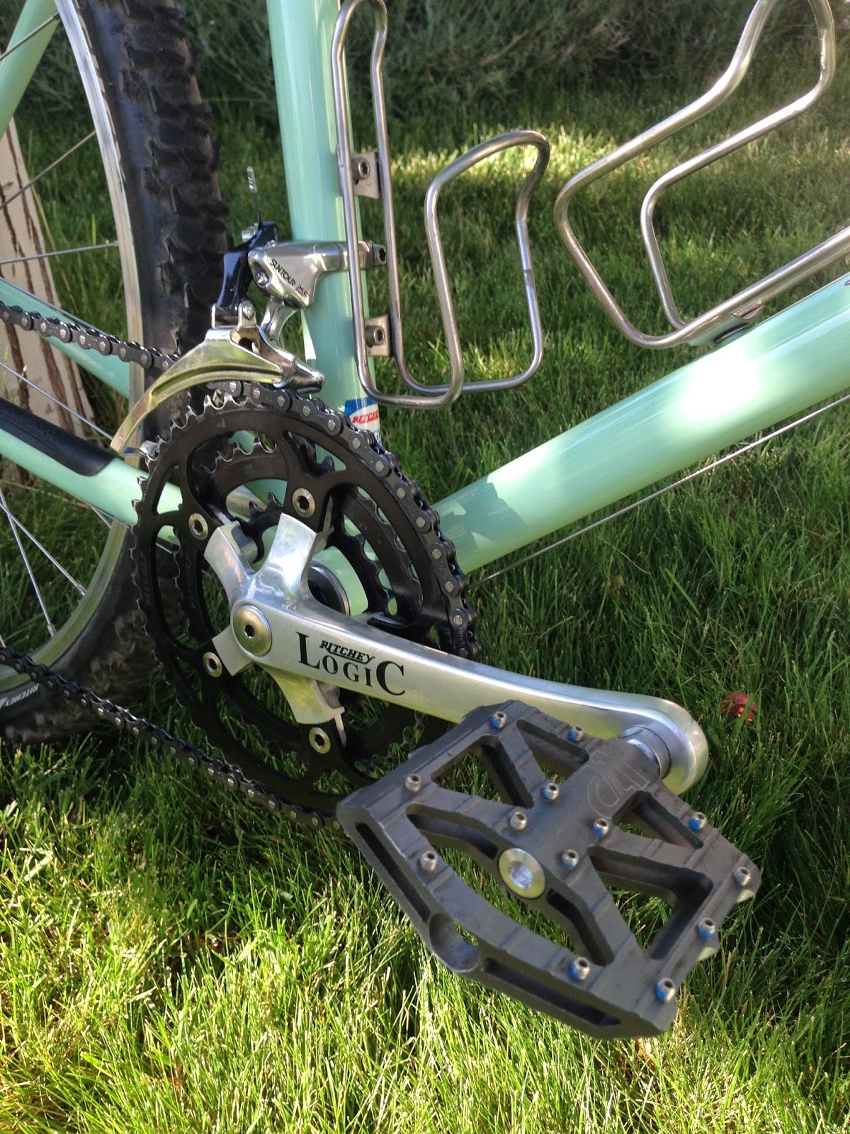
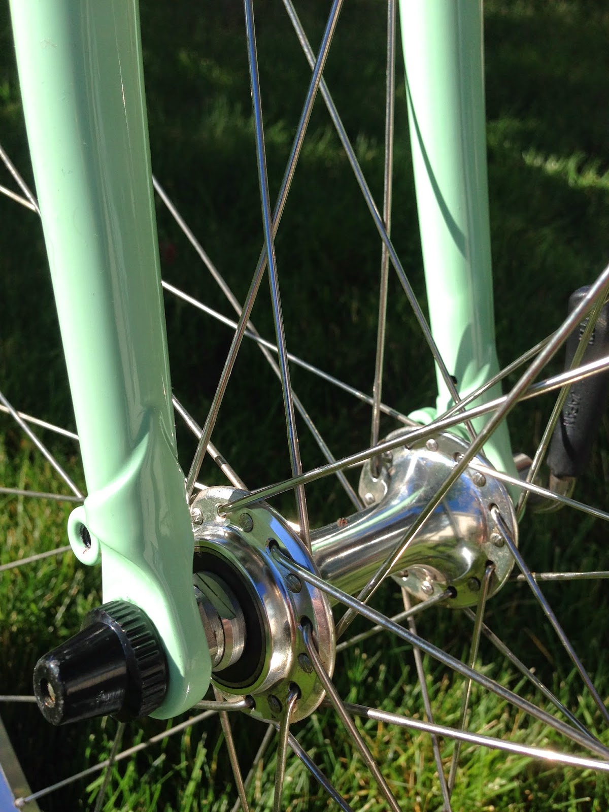
The rest of drive train included XCPro Derailleurs from Suntour as well as brakes from the company. The shiny Microlite Suntour hubs are attached to Ritchey hoops. The Ritchey Crankarms were striking as well. Elegant, Low Q, and a nice polish to them. Clearly the silver was growing on me as I noticed the way the sun popped off of the gleaming finish of the bike.
The bulk of the other parts were also from the Ritchey archive. The seatpost, stem, bar, headset, grips, tires, filled out the rest of the bike. On top of that seatpost sat a stately black Brooks Leather Imperial saddle. It was a nice touch as was the Bridgestone Bicycle bell attached to the bars to signal to other users on the trail.
Now, about those wheels…26 inch size must be a joke right? Everybody knows going bigger is better. My 29er rolls over things like a steamroller. And who rides a lugged frame anymore in spite of the claim that a “in a traditional lugged joint, the lug serves as external butting increasing the strength of the joint.†Surely the lugs with that Ritchey Logic Super Tubing by Tange, and the bike was going to be an anchor.
Total weight: 23.8 pounds
The Ride Report:
It was with a bit of trepidation that I put my leg over the bike and headed out to the closest trail to my house. The comfortable Brooks saddle flexed under me almost acting like a bit of rear suspension as I hit the first bumps on the trail.

Having that absolutely anorexic looking steel fork in front of me made me a bit worried but as I hit the singletrack I noticed immediately how precise the handling was on the bike. I looked at my best line and front wheel seemed drawn to it. A surprise rock on the trail as I rounded a bend and with a little flick I was around it. None of that steamroller effect from my modern suspension bike.
Soon I found that the bit of flex in the steel frame and the smaller wheels made the bike feel absolutely spritely when getting up to speed. When climbing the bike’s 23+ pounds felt nimble and light with the smooth, simple shifting allowing me to feel secure in my gearing choices.

When descending, the precise handling helped when choosing a line and I was able to slide my weigh off the back of the saddle and rely on my legs as suspension and the Ritchey Zmax tires to dig in and securely carve turns and pop over any obstacles.
A couple of hours into the ride I stopped by the Truckee River to eat a snack and hydrate. As I sat there I gazed at the Resurrectio and enjoyed the play of light on the water, sparkling off the gleaming silver parts and shiny frame. I realized I had been won over by the beauty and simplicity of this elegant machine. Is it the bike for every trail I ride? Maybe not. But if the design and success of this design is any indication, we are going to see a new wave of big bike companies jumping on the bandwagon touting the smaller wheels and “nimble and simple†in the next few years as riders discover the joys of a light and fun riding bike with an elegant aesthetic and a bit of soul.

The bike review above is a bit of a tongue in cheek write up of my newly repainted 1992 Bridgestone MB-1. I borrowed liberally from the original 1992 Bridgestone catalog. The paint was done by GroodyBros out ofKansas City who did a spectacular job with the paint and with applying the decals that are available from Rivendell Bicycle Works. The headbadge was taken from a design from the original Rambler bicycle company that dominated the industry in the early years of the bicycle boom in the U.S. plus the name came from the earliest recorded bicycle club in the Reno area. Insigniaworks created the actual badge.

|
AuthorFor over 12 Years I wrote the Reno Rambler Blog covering everything from Bicycle Advocacy, Reno Politics, Popular Culture, and my experiences as a long-time cyclist. Archives
January 2023
Categories
All
|


 RSS Feed